


5 Tips to Optimize Your Website to Be Mobile Friendly
Sangeeth. K13 Sep 2023
How much time do you spend on your smartphone compared to any other digital device? Answering this question yourself will help you understand as a website owner how important it is to have a mobile-friendly website for your business.
It is estimated that on average an individual spends 5 hours a day on their smartphones. Half of them are probably watching cat videos but yeah, you get what we are trying to say…In fact, there is a solid 95% chance that you are currently reading this on your smartphone too!
Having a good user-friendly website is a basic necessity for your business in the current business scenario where everything happens online! Most people discover new products and services, brands, and companies through their mobile devices.
Once people find your business website online and if it is not mobile optimized, and has poor website design and content, they won’t think twice before exiting your page. You can’t really blame them, can you? Put yourself in their shoes and you would do exactly the same.
When we say “optimized,” we mean that your website really needs to look incredible on mobile devices. Also, it should load quickly and be simple to navigate and engage with. If you can accomplish that on a mobile device, your website should look great on a full desktop as well.
Through this article, we will walk you through the concept of mobile-friendly websites, tips on optimizing a website for mobile devices, and the reasons you should have a mobile-optimized website. So let’s dive right into it.

What’s Ahead
Tips for Increasing the Mobile-Friendliness of a Website
Going further we are going to discuss various ways in which you can focus on increasing the mobile-friendliness of a website. But before we dive into the tips, we need you to understand that you don’t have to implement them overnight. You need to take your time to fix them and understand what works for you and your customers.
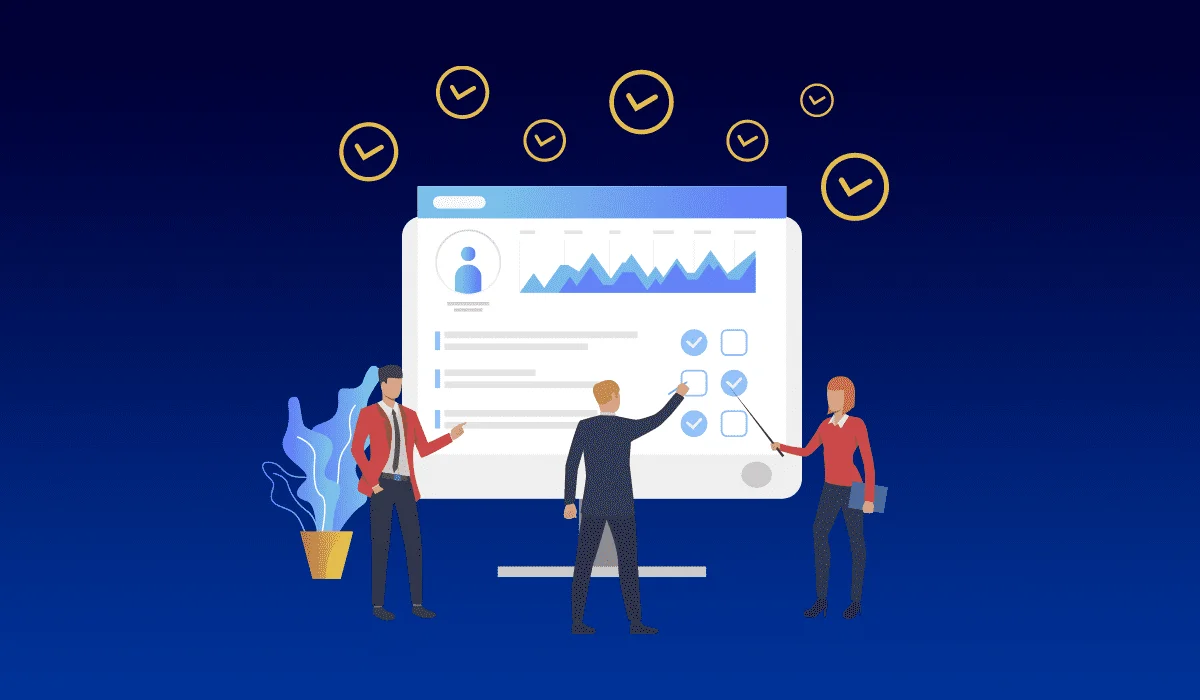
Tip # 1 Run a Mobile-Friendly Test Using Google’s Mobile-Friendly Tool
First of all, we recommend you see how your site is currently performing by running a mobile-friendly test in terms of mobile-friendliness before taking any additional action.
This will enable you to focus on the relevant parts of your website that require improvement and provide you with essential information on how to do it.
Simply browsing your website on many devices is one method of running a mobile-friendly test. You can make use of your own mobile devices and tablets to browse through the web page to get a deeper understanding of how it performs.
By doing this, you will get to know how quickly the site loads, how effectively the design adapts to smaller screens, whether the content can still be read, and how user-friendly the navigation is.
After trying it by yourself, you can make use of a specialized testing tool to dig even further. Fortunately, Google has developed a free tool called the Mobile-Friendly Test Tool, which you can use to determine whether your website meets its requirements for mobile sites. You can make use of this tool and fix the errors in your website.
Tip # 2 Select Responsive Plugins and Themes
One of the greatest benefits of using WordPress while making a website is, how simple it is to use the CMS to build a responsive website.
Nowadays, it’s really more difficult to design a non-responsive website. If you are careful enough to choose the right themes and plugins your website will do just fine.
Most of the inbuilt themes are created by keeping mobile-friendliness in mind. This helps you to pick appropriate themes and can help you save time. You can avoid manually setting media breakpoints and CSS grids.
You will also get an option to test these themes and check previews if you want by running a demo. You can also make use of staging websites to test the user-friendliness of the themes.
Tip #3 Make Your Website Responsive with Custom CSS
Using CSS (Cascading Style Sheets) is a crucial aspect when it comes to putting together a responsive web design into place. You’d be amazed at how far you can get with just a little CSS expertise in terms of creating a mobile-friendly site.
As an example, you can utilize CSS to implement what are known as “media query” ranges. Based on the size of the screen being used, you may instruct browsers to load various page layouts at different times using media queries also known as responsive breakpoints
Tip # 4 Reduce the Loading Time of Your Website
As we mentioned earlier, the loading time of your website is another crucial element on your website.
Your bounce rate will go down if you speed up your website, and your users’ experience will definitely be enhanced, which can be beneficial for business.
The following are some of the most effective techniques you can implement on your website to reduce loading time:
- Implement caching
- Compressing your images
- Using Content Delivery Network
- Keeping every aspect of the website up to date
- Minifying code
Tip #5 Select an Authentic Web Host
One of the most important choices you’ll have to make is choosing the best web host for your website. The simple truth is that no amount of effort on your side will be able to prevent a poorly functioning website if you select a host or plan that doesn’t provide the speed and resources you require.
Your web host plays a crucial role in how well your website performs. And the first thing we should consider while making a website mobile-friendly is its speed.
Keeping this in mind, you should select or upgrade to a plan that can ensure continuous great performance and almost no downtime.
Reasons to Have a Mobile-Optimized Website for Your Business
Now, let’s discuss what’s all the fuss about mobile-optimized websites. What are the reasons that make it so important to have one?
Your Potential Customers Are Using Mobile Devices
As we already mentioned before, everyone uses their smartphone for an average of 5 hours per day and you are more likely to get discovered through a mobile device.
This makes it the most important reason to have a mobile-friendly website. Half of the web traffic comes through mobile devices, so make sure to give your audience a good browsing experience.
Helps You to Be In Competition
Every business owner is now more and more focused on improving their digital presence, you don’t have to be the one who falls behind.
Giving your audience a trouble-free and happy website experience is all you need to provide for you to have a competitive advantage over others.
Helps You Build Trust
Having a well-designed website can help you win the heart of your audience. If you greet them with a poorly designed website they will probably think that you are just another spam website. So don’t let that happen.
Makes It Easy for Your Audience to Connect With You
Our website is where we give all the information relating to our business including our address and contact details. Anyone who lands on your website should be able to find your contact details.
This will help your visitors to have easy access to all this information and get in touch with you if they want to. They should be just one click away from reaching you.
This is convenient for both your business as well as your customer. There is a high chance of turning such leads into sales.
Helps You Provide a Better Experience to Your Audience
A website that has simple navigation and a visually appealing design undoubtedly gives visitors a good browsing experience. You have no one else to please but your audience. Make sure that you leave a good impression in their minds for your visitors. This can be possible by increasing the mobile-friendliness of a website.
Wrapping Up
Considering the digital world we live in, where everything is just one click away, it’s high time that you consider running a mobile-friendly test for your website and checking what things you are lacking.
The goal is to optimize your website so that it works smoothly without any trouble and is easy to use on mobile devices. If not there is a chance of getting penalized by search engines.
We hope you got some idea about why you should focus on having a mobile-friendly website and how to make a mobile-friendly website.
If you wish to create beautiful websites for your business don’t think twice! You are at the right place. Get in touch with us today to learn more about the website development services we provide at Loonyheads!
Latest Post
5 Do’s and Don’ts When It Comes To SEO
 18 Sep 2023
Readmore
18 Sep 2023
Readmore


Want to learn more about the digital marketing service we provide?
Contact Us to Get Started!